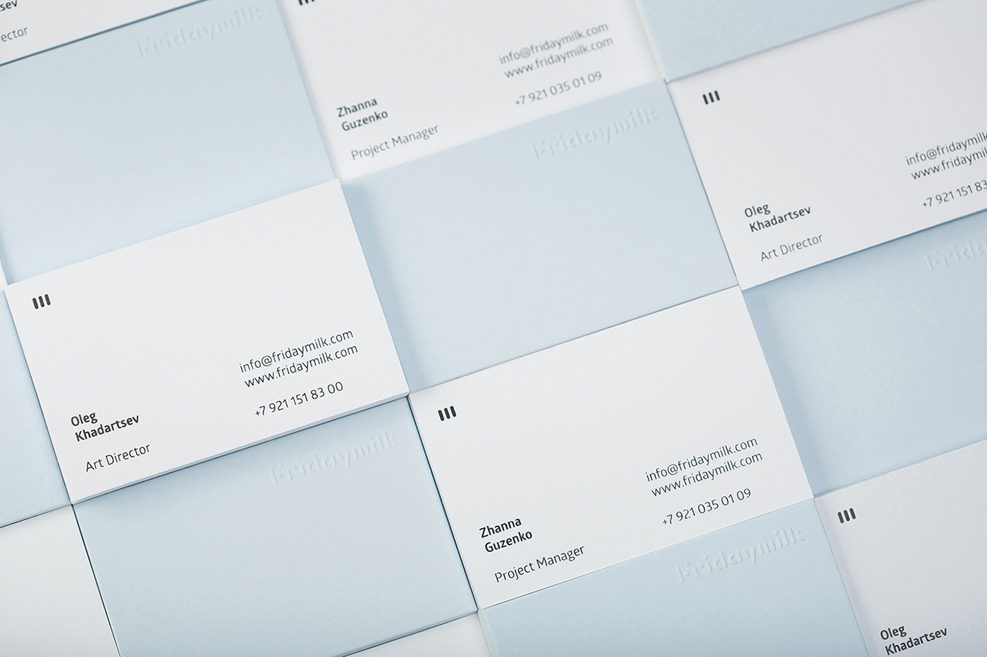
Fridaymilk – Branding
abduzeedo
Oct 31, 2016
Fridaymilk is a branding and visual identity project for an independent curating organization based over the Polar Circle which aims to develop culture and media in the North. There’s a lot to love about this project but for me nothing beats the simplicity. The business cards are simply gorgeous, especially the back of the card, which looks like ice.
United by the idea of Northern identity they are promoting the concept of cultural decentralization by shifting the cultural centers «from capitals to remote areas».
A project team creates unique media content, also implies different instruments for «off-line» events like art-conferences, panel discussions, international and public sector collaborations.
It is a long dialogue of artists, curators and young generation what it is a life in the High North and a constant search for a meaning and goals to stay and grow in this area.
It is a platform for materialization of new ideas and life stories, it is a big expedition for searching an answer for a key pillar in the High North whether to «leave or live».
Credits
- Art Direction:Value ., Vladimir Ilnitskiy
- Design: Value, Vladimir Ilnitskiy
- Photography: Molokostudio, Oleg Khadartsev
- Printing: First Sense


