Weekly Roundup: Mozilla New Logo, LinkedIn Facebook-like Redesign and more
AoiroStudio
Jan 22, 2017
We all had a long week of work, school and maybe vacation (some of us) and after spending some time relaxing with family, friends; we’ll mostly spend be ready to tackle a new week. Before you do, it’s time for the Weekly Roundup where we curated our some of the interesting things that happened on the Web either it is news, a new tool to try, a cool video and some sites inspiration that caught on attention. We’ll also include some Abduzeedo articles from the past week just in case that you’ve missed them. Time to sit back, see what you’ve missed and gear up for the next one.
If you do have any suggestions, send us an email or via Twitter @AoiroStudio
From the Web
Google and LG are reportedly launching the first Android Wear 2.0 watches next month via TheNextWeb

Why India is the perfect testing ground for self-driving cars
via TheNextWeb

Mozilla just revealed its minimalist new logo via TheNextWeb
Remember when Mozilla launched a contest to design its new logo? Well, out of all the zany designs submitted, Mozilla seems to have gone with one of the most minimalist. Say hello to ‘moz://a’.
LinkedIn launches huge Facebook-like redesign to be less confusing via TheNextWeb
LinkedIn’s Website gets a huge redesign to be less confusing. If you’re like me, chances are you’ve used LinkedIn a few times while looking for a job, filled in your information, and then rarely touched it again.
Pingu via Product Hunt
Get the best prices & delivery times for any product
GradientDaze via Product Hunt
Gesture based gradients never felt so good
From Abduzeedo
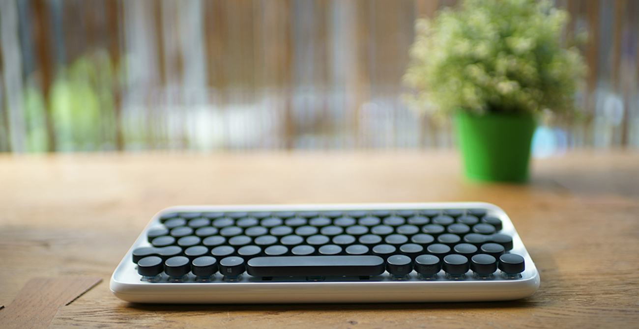
The Perfect Office – Heng Balance Lamp, Mission One Computer and Office Ideas

Interior Design: NL2 SMA
NL2 SMA is an interior design and architecture project shared by Anton Siriak. I rarely post about interior design, I usually write posts about architecture, however there’s something about this project that really caught my attention. I am fan of simple interiors, minimal. I love when everything is sort of hidden and whatever is visible is because it has a purpose a bit more than just decoration. Anton’s project embraces all of that, with the addition of a stunning outdoor space. Check it out and let us know what you think. For me, I will just dream of having my house looking like that, one day.

Illustration: The Dark Knight Trilogy by Krzysztof Domaradzki
We are sharing an illustration poster series about Christopher Nolan’s Dark Knight Trilogy by Krzysztof Domaradzki. I have been a huge fan of this trilogy because it’s a modern take of what Batman could have been in our times. With Christopher Nolan genius direction, it’s a trilogy that was truly memorable filled with so many great moments of cinematography. Along those lines, Krzysztof’s work on this illustration sets the tone right with its monochromatic colour scheme.

UI Design – Trello Atlassian Redesign Concept
Trello Atlassian is a UI Design concept project for the redesign of the popular service Trello. It was originally shared by the Netguru Team and it’s an extensive exercise on how to improve a tool that their team use daily. They also got motivated by Atlassian’s acquisition of Trello and that motivated them to think about a complete visual refresh of the product and try to make a little bit “slicker” – as they mentioned.

Everyday Miniature life by Tatsuya Tanaka
Do you like photography and miniature scenes? You have come to the right place. And you will certainly enjoy Japanese artist Tatsuya Tanaka’s work. He creates inspiring and intricate everyday life scenes in a miniature world. A place where broccoli becomes a huge tree. A world where tiny men operate sushi trains and much more. From skiing to meetings, swimming in a guitar to food markets, the artist has an unique style to portray daily things. Since 2011 Tatsuya has an ongoing project called Miniature Calendar. Miniature Calendar is a project where he portrays everyday life scenes depicted in diorama style. He updates his website daily with new pictures. The small worlds that he creates are filled with creativity, humor and personality. The images will totally take you on a trip through a tiny parallel universe.

Motion Design/Typography – Skatepark
Skatepark font as the name suggest is a typography but also motion design project shared by Keisuke Terashima. Throughout these 10 years of Abduzeedo we have seen many very creative projects where the designer explores different ideas for a family face, however, this one that Keisuke put together has to be one of the coolest. Perhaps, because I am a fan of skateboarding, but the idea of mixing skateboarding and its beautiful tricks with letters reproducing obstacles is nothing less than amazing. The animations are top notch as well and aligned with a cartoonish style it reminds me of a video-game. Anyways, enough said, check it out the full alphabet with tons of flips, grinds and other rad tricks.

